
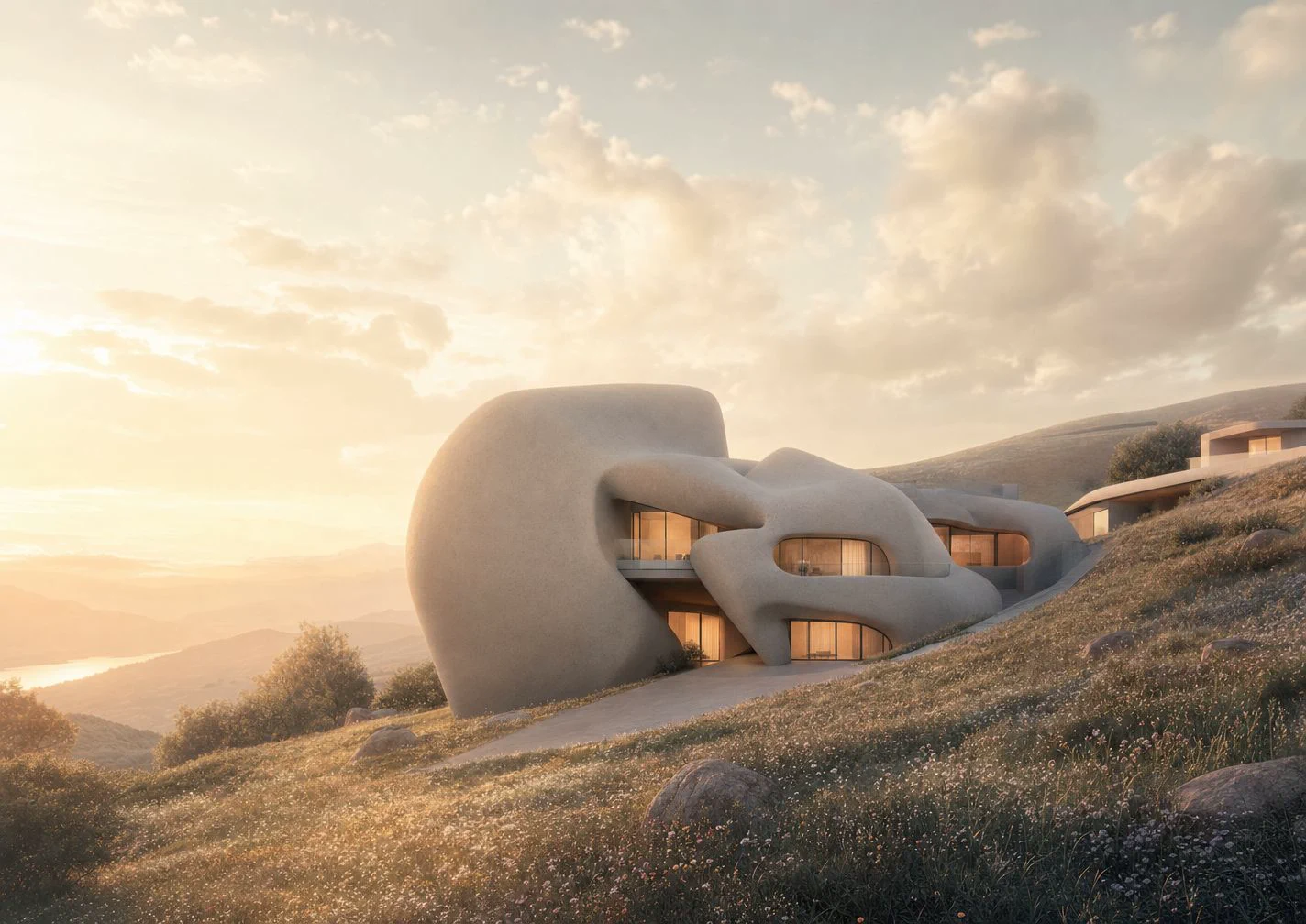
The first image
The first render was quiet and convincing, but it only described an object. It did not explain how someone reached it, where the public path widened, or why the building belonged on that edge.
Nora kept the image, then placed site photographs, a plan crop, and two waterfront references around it until the missing pieces became obvious.
The prompt was not wrong. The question was too small. The team had asked for a pavilion, when the review needed to understand arrival, pause, view, and public edge.
The public edge
The scheme changed when the canvas stopped treating the pavilion as the subject.
What changed
The pavilion did not need more shape. It needed evidence of use. The team extended the paving, widened the threshold, added seating, and let the water sit behind the public edge rather than in front of the architecture.
Each pass kept the same camera height so the comparison stayed fair. One image tested a thinner roof. Another tested a stronger promenade. A third moved the figures closer to the waterline so the edge felt occupied.
That shift made the image less iconic, and much more useful for review.
"The object was fine. The edge was the project."
Review result
The final discussion moved away from whether the pavilion looked beautiful and toward where people enter, pause, gather, and look back across the water.
The original object render stayed on the canvas as a mood reference. The edge study moved into the presentation because it could explain the site decision, not just the form.
More notes.
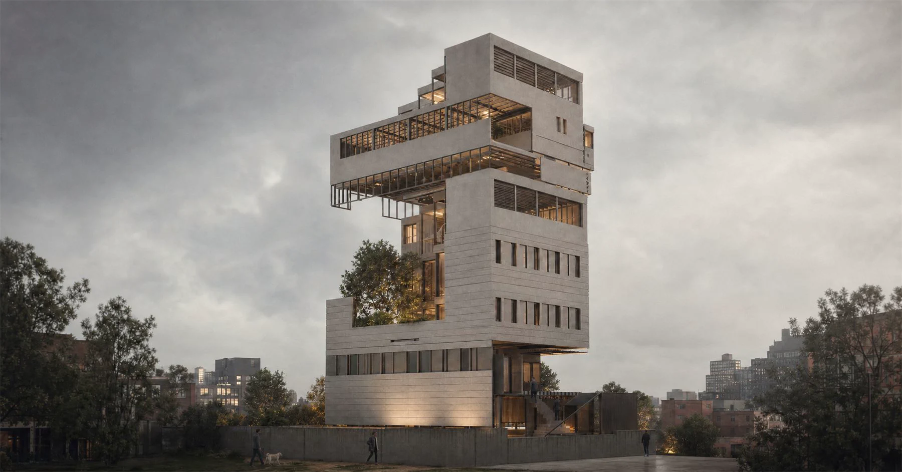
Adaptive reuse study

Three reuse options, one retained frame, and a site note on what changed the brief.
Read More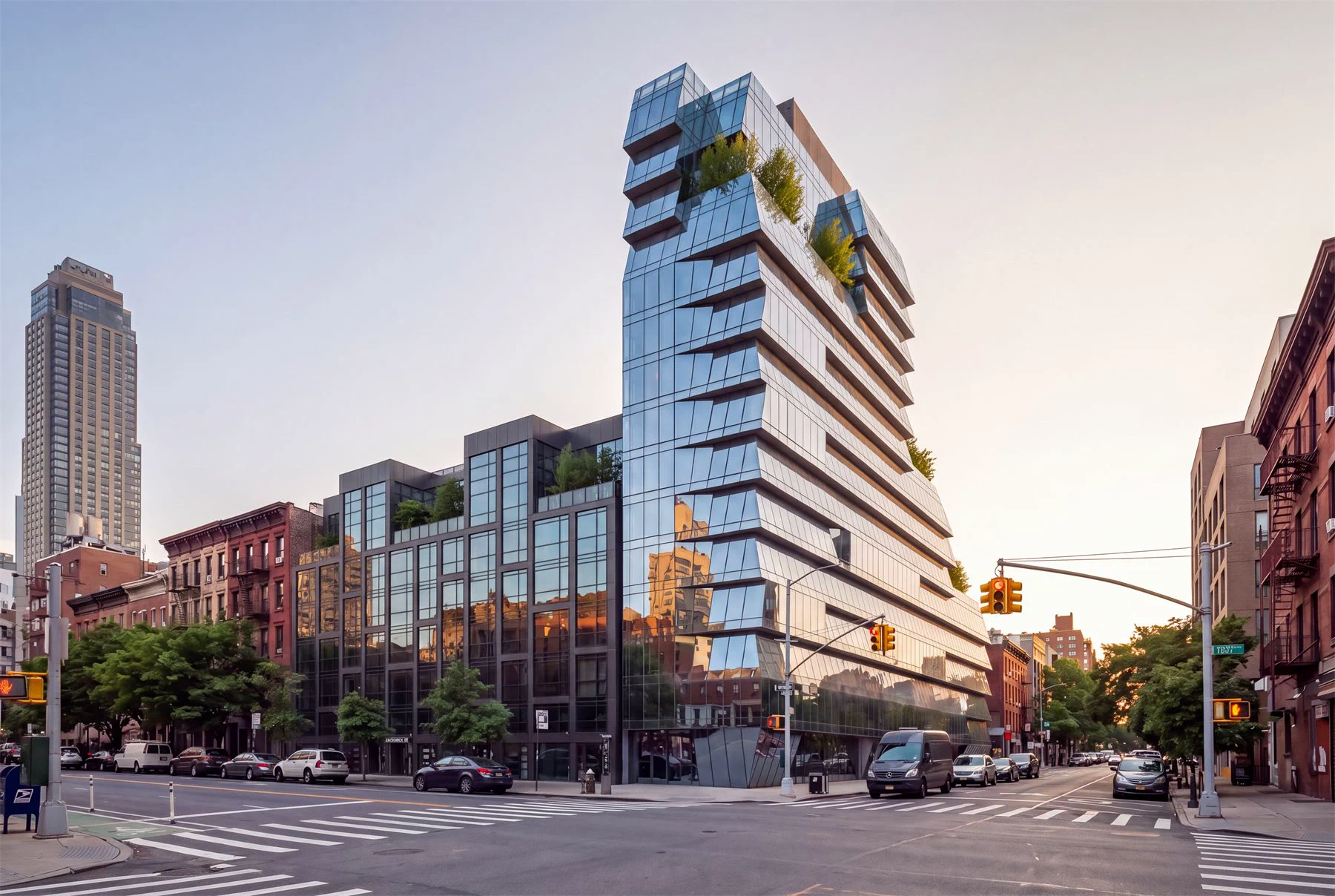
Rejected studies visible

Mira tags eighteen rejected views by reason, turning old options into a sharper review board.
Read More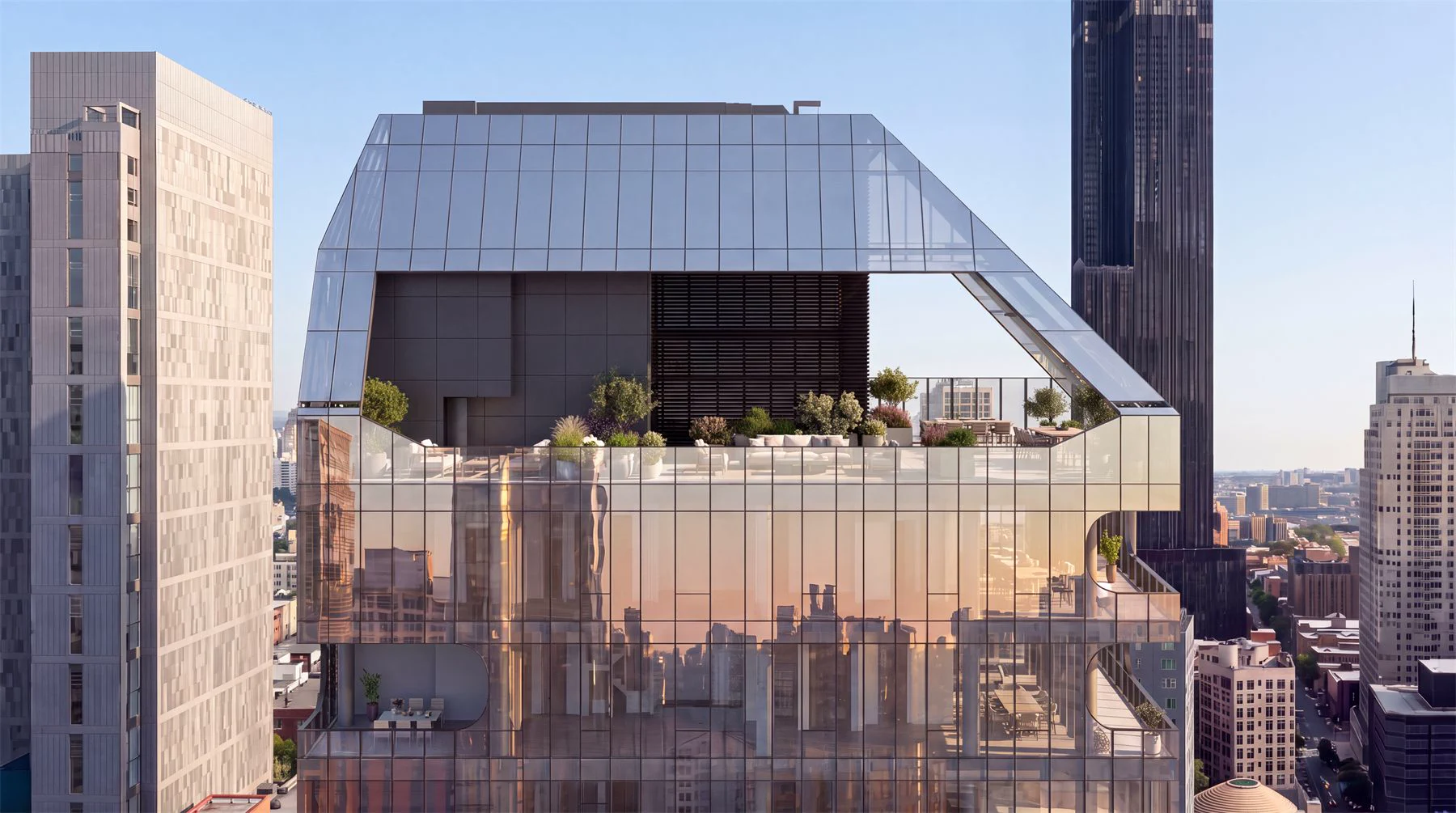
Material prompt session

Loki builds a material prompt board from pinned references, one-word passes, and stop rules.
Read More